Saturday, May 30, 2015

Calling Hitchcock fans ...

For my Lost Coast Designs design team post today, I am showing a little love to the great man himself, Alfred Hitchcock : 
This is a 4" x 4" card, featuring two stamps, Fourth Dimension from Lost Coast Designs and Alfred Hitchcock Standing from Carmen's Veranda.

I love the old Hitchcock movies, and some of his quotes are great, like this one :

"Drama is life with the dull bits cut out"

I colored my background with distress inks, stamped the Fourth Dimension over it in black, then colored a random selection with a white gel pen. I die cut a black film strip, added some detailing, distressed it and backed the photo strip holes with co-ordinating cardstock. Hitchcock is stamped in black and colored with inktense pencils. I added a layer of transparency over him and wrote the quote by hand :)

Thursday, May 28, 2015

APC week 25

Here are my week 25 Altered Playing Cards, the backgrounds are all about alcohol inks on glossy cardstock :)

For the first one I used the dog from Stampotique. The dog is stamped in stazon on mixed media paper and colored with Neocolor II's. The brick work ground created using a stencil :
 For the second I used a star stencil with versamark and clear embossing powder, and a paper airplane stamp from Penny Black. I stamped it in coffee archival ink, then stamped separately on crumb cake card stock and paper pieced some of the planes :
And both APC's together :


Wednesday, May 27, 2015

Add some ribbon to an ATC

For my Wicked Wednesday make this week I have added ribbon trim as a banner, and I used fabric for the background. The sponsor this week is The Fantasy Art of Nikki Burnette. Meet Josie :

Josie is colored with copics and white gel pen details added. Isn't she gorgeous.

Thanks for stopping by x

Wednesday, May 20, 2015

'Harlequin' is the new Wicked Wednesday challenge

'Harlequin' or diamond pattern is the challenge at Wicked Wednesday, and the sponsor is Sweep Pea Stamps. I have used Rebecca Sinz's 'To bid you Farewell'. 
The angel is colored with copics, her skin with Lindys Stamp Gang starburst spray, it has a lovely sheen. For the background I used a distressed orange background paper, then I stamped the harlequin shared in light brown ink, adding highlights with an india ink pen. I used a word spencil and moulding paste, and when it was dry drew the red circles.

Saturday, May 16, 2015

News at Lost Coast Designs and Carmen's Veranda

... A new challenge and events blog

Welcome to the Grand Opening of our new Event & Challenge Blog where the stamps of Lost Coast Designs and Carmen's Veranda collide to bring you Twice the Inspiration and Double the Fun!

We've got so many fabulous events planned for you this year! There's going to be lots of Design Team eye candy and many events for you to get involved in and win prizes galore!

You can look forward to awesome blog hops, new stamp release news, A Different Point of View segments, articles, contests, tutorials and Guest Designer features and more, much more!

PLUS our Lost Coaster's Review Challenges will now be hosted here starting with the June Challenge on June 1st! Our challenges will continue to start on the first Monday of every month!

Exciting times ahead so become a Follower and STAY TO PLAY!

Lost Coast Designs and Carmen's Veranda offer a sophisticated line of unique, quirky and alternative images covering vintage, Steampunk, game pieces, collage, shrine, angel, gothic, horror and much more to excite your creative impulses!

To celebrate our grand opening we are throwing a 10 week long event (approx. 2 months) to showcase the stamps featured on the NEW IMAGE pages of both stamp lines!

Win a $20 gift certificate to spend at either company or a combination of both!

How YOU can Play and Win a Prize!

Click on the links below, check out ALL our fabulous stamps, shop, create and submit your projects featuring Lost Coast Designs or Carmen's Veranda stamps or a combination of both into the Inlinkz collection below by midnight PST on July 22nd!

1. Become a Follower of Lost Coast Portal to Creativity!
2. Please only link up projects using our stamp images.
3. One exception to the rule is...you CAN use sentiments by other companies if your project "needs" it!
4. Include a link back to this post when you share your projects on your own blogs!
5. Grab our blog badge, share it on your blogs and spread the news of our grand opening!
6. Your submissions are not restricted to just the new LCD and CV stamps, you can submit projects featuring ANY of our stamps BUT if you do use our new images then your name will be entered into the prize drawing TWICE!

Check out our new Lost Coast Designs stamps!

Check out our new Carmen's Veranda stamps!

The Lost Coast Design Team have created some fabulous eye candy for your inspiration!

Let's get the party started! 

Her is mail art I made created using the Cityscape stamp from Lost Coast Designs :

Here is mail art I have made using  one of the new images from Lost Coast Designs :

I have used the Cityscape image, stamped in black and added some white gel pen details :

 I have actually stamped around the whole envelope so the Cityscape is continuous : Here is the back and front of the envelopes : 
The envelope is sponged in distress ink, then I have used the journaling guide stencil to add another layer of interest by sponging in the same colour over the top. Once I get some nice and colour co-ordinated postage stamps on there it will look even better I think :)

Please come and join us at our portal to creativity, it will be fun :)


Thursday, May 14, 2015

Wings ATCs

Making ATC's for a mixed media trade entitled 'Wings', I have this gorgeous Lucine moth from Designs by Ryn, so have created my night sky to showcase this gorgeous creature. 
The moth is stamped in coffee archival ink and sponged with frayed burlap distress ink. The wings are stamped on vellum with coffee archival ink, them embossed in Wow pearl white embossing powder. Can you see the shimmer and how the brown still shows through but it's changed - I love it. A close up : 
I used my copics to color the back of the moth, in a blue and a mustard color. So you get some color showing through the vellum.

For the background of the ATC I added molding paste with a pallet knife, when it was still wet I pushed some of those little tiny pops into the paste. When this was dry I was still a bit worried about them coming off so added a layer of gel medium. Then I sprayed with dylusions inks. When it was dry I sanded the top a little to expose some of the pops, and added some splashes of white acrylic paint.

The wording was very exciting .... I got myself a manual typewriter. Woot woot. Years ago I remember going to night classes to learn to type, but its been such a long time. I will have to get used to it again. So I used it for the wording and LOVED it, here is my new beauty : 

I hope the recipients like their ATC's, and I also entered this ATC into Ryns monthly challenge :)

Thanks for stopping by :)

Wednesday, May 13, 2015

Love the smell of lilac

I just love the smell of lilacs, such a fresh and atmospheric smell. Smell is the sense most powerfully linked to memory, and I think I relive aspects of childhood through this gorgeous aroma. 

The challenge at Wicked Wednesday is daffodils or lilacs, and I have used this french lilac image from Power Poppy :
It is colored with copics, and fussy cut. The sentiment is also from Power Poppy.

Friday, May 8, 2015

Older and wiser ...

New challenge at Lost Coast Designs, #12 is to make an Artist Trading Card. I don't know if anyone has noticed that I quite like making ATC's ..... LOL.

Here is my DT make and an extra little something else ...

This ATC features the very wise and formal owl from Misc Anthropomorphs and also 'Wisdom' is lightly stamped in the background from dictionary words
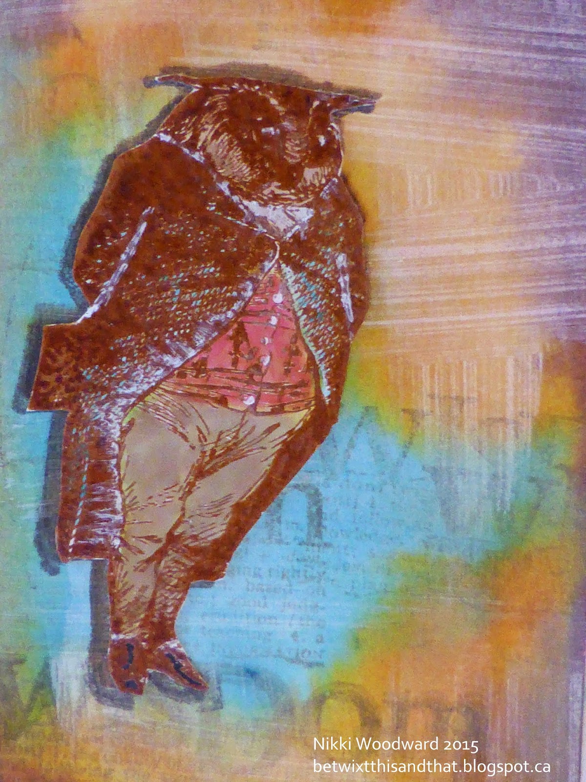
 The background was made with distress paint and distress stains. The paint applied first and when dry it acts as a resist for the stain. I spritzed the ATC with water once I had added the stain and moved the card around so that the colors ran and gelled together a little more. I really like this effect. 

The owl was stamped in dark brown into onto my ATC, then onto white gloss card stock in brown archival, which I embossed with clear powder and colored him with distress inks and stains. When I had fussy cut him and was adding him to the ATC I glued him down slightly to the right side so there is a shadow behind him.  I also added a little white gel pen to pick out some of the details.

A close up of my owl : 

 For the back of my atc I did a similar technique to the front of the ATC, but I used a more absorbant paper - wow look at the different in the colors and how they merge together. I stamped the owl once and then added my ATC label. Lost Coast Designs have some really wonderful ATC sized images.
Now here is something extra. I make so many ATC's that my binders are bulging at the seams, so I decided to turn some of them into cards.

Here is the card I made, for a 50th Birthday for a friend :

I have done the same background technique, but then I used the Journalling tool / stencil to add the waves. I spritzed it all with water and removed some of the ink with paper towel, the added my journaling. Quite often we don't like our own handwriting - have you found that ? So I decided to go against that instinct and write :)

Hope you found some inspiration here, and maybe feel inclined to leave a comment or join our challenge over at The Lost Coasters Review :)


Thursday, May 7, 2015

Altered Playing Cards week 24

The Altered Playing Card (APC) challenge has actually ended, but I still have a few weeks to catch up on. I think I just dont want it to end ! LOL. Here are my week 24 makes :


For this APC I have used the new zombie cat from Vera Lane Studios. He is feeling very frustrated with the birds on the wires tweeting away. LOL He is in a set of 3 digital images, with a sentiment. What a cute kitty he is :)


For the second APC I have used the steampunk wing die from SCACD. I love this shape of the negative cut :


This is my pair of Altered Playing Cards :


Wednesday, May 6, 2015

Polka Dots

Fun adding dots this weeks for Wicked Wednesdays 'add polka dots' challenge. 

The image is by Just some Lines, this is Pixie Dandy Lion colored with copics :
Dotty papers, dots on her dress and of course she is making a wish :)

Sunday, May 3, 2015

Vera Lane Studios zombie

Loooove these new zombie digi images from Vera Lane Studios, who would have thought zombies could be so darn cute ?

So I might have recently purchased distress inks in seedless preserve and chipped sapphire ;) Decided to color the zombie with them, love the color combo.
I dabbed the pads direct to my craft sheet, spritzed it with water and ran the tag through it for the first layer of color. The I used a stencil and sponged with the two colors. I stamped the weird stitch pattern in chipped sapphire and clear embossed it. This stamp is from a set by Tim Holtz/Stampers Anonymous Classics #6. I used molding paste and a word stencil to add 'Funky' and I used it around the edge of the tag.

The image was printed and colored with a paint brush and the distress inks. He was fussy cut and glued into place on a little strip of washi tape. The gems and ribbon were added at the end. 

I cant wait to create with the other digis in the set, the girl and cat zombie - watch this space :)

Friday, May 1, 2015

Spring

For the spring challenge over at Southern Ridge Trading Blog I have made a card, spring is all about rebirth and regrowth, my tree is blossoming, my returning birds are nesting :
The tree is : NAT-333 and the birds in flight are : NAT-615 - coming to the website soon.

The background is an emboss resist with a stencil. The tree was painted with acrylic paint.
The grass is painted with acrylic paint and a dry brush, and the words lightly stamped in the grass "All things grow with love".

Few details about the tree :

Once I had created my background, I painted the tree and when the paint was still wet I stamped it onto my card. I know, it looks a total mess doesn't it, but there was method in my madness. I wanted to give the tree some depth, emphasize its dimension.
I used a thick body acrylic so that I was able to add texture to the trunk, then each leaf was meticulously painted in a pale green, with the shadow added with aqua acrylic. 
 The final touch was to add a little dot of liquid pearls to simulate the blossom. I had decided to put the tree off the card and trim the edge. I then glued these discarded branches onto the remaining tree.